

Where maths meets magic, the brand story of The Digital Maze
Project Role:
Brand Designer, Team Member
Agency:
The Digital Maze
Client:
The Digital Maze
Skills
Brand Research
Design Thinking
Teamwork
Stakeholder Management
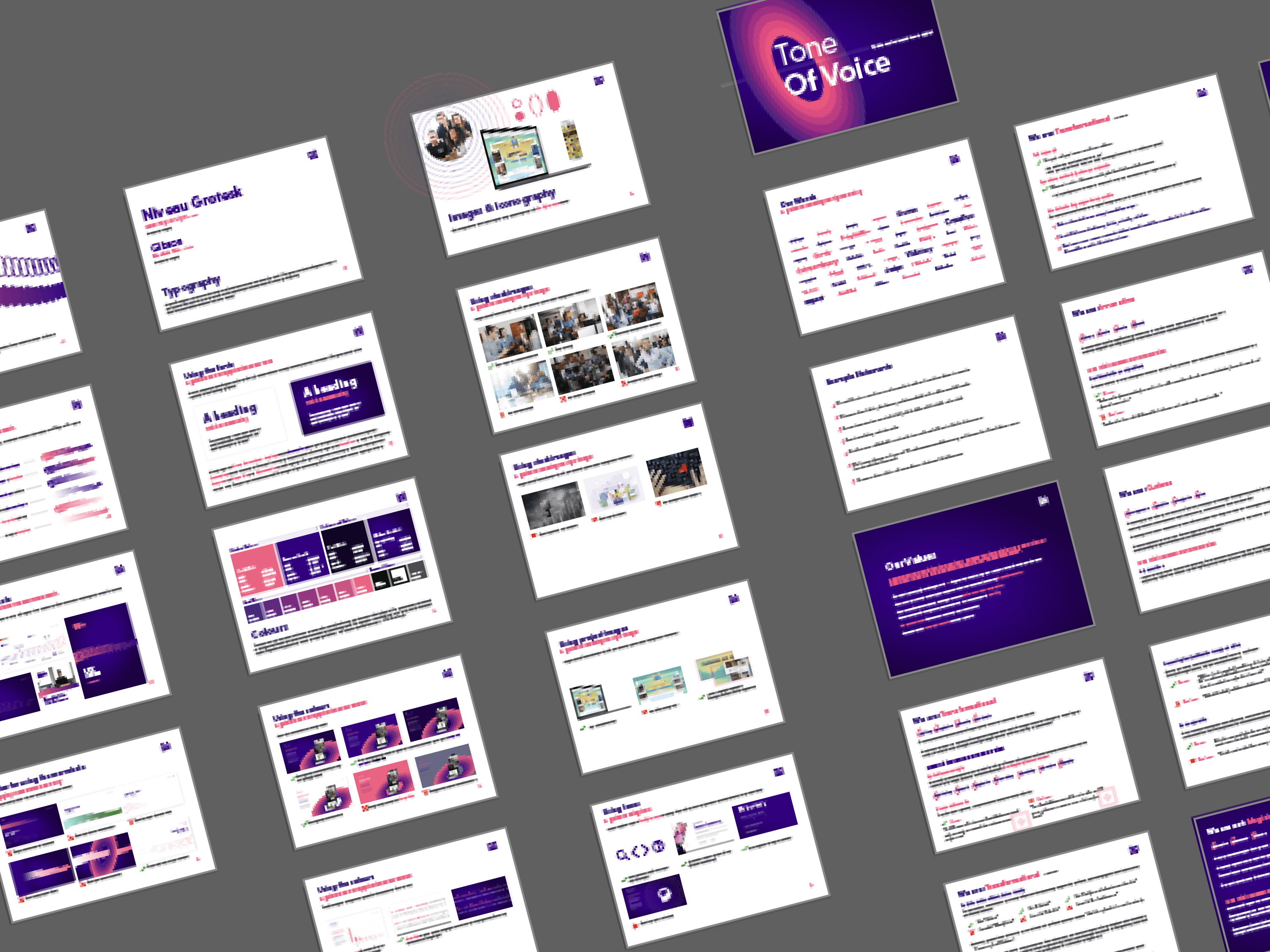
Tone Of Voice
Branding

In the fast-paced world of digital agencies, standing out requires more than just technical excellence—it demands a brand that captures both the analytical and transformative nature of the work. This is the story of how Digital Maze evolved from a hasty merger-driven rebrand into a compelling identity that truly represents our unique approach to digital transformation.

The birth of Digital Maze came during a period of significant change, as multiple agencies merged into one entity.
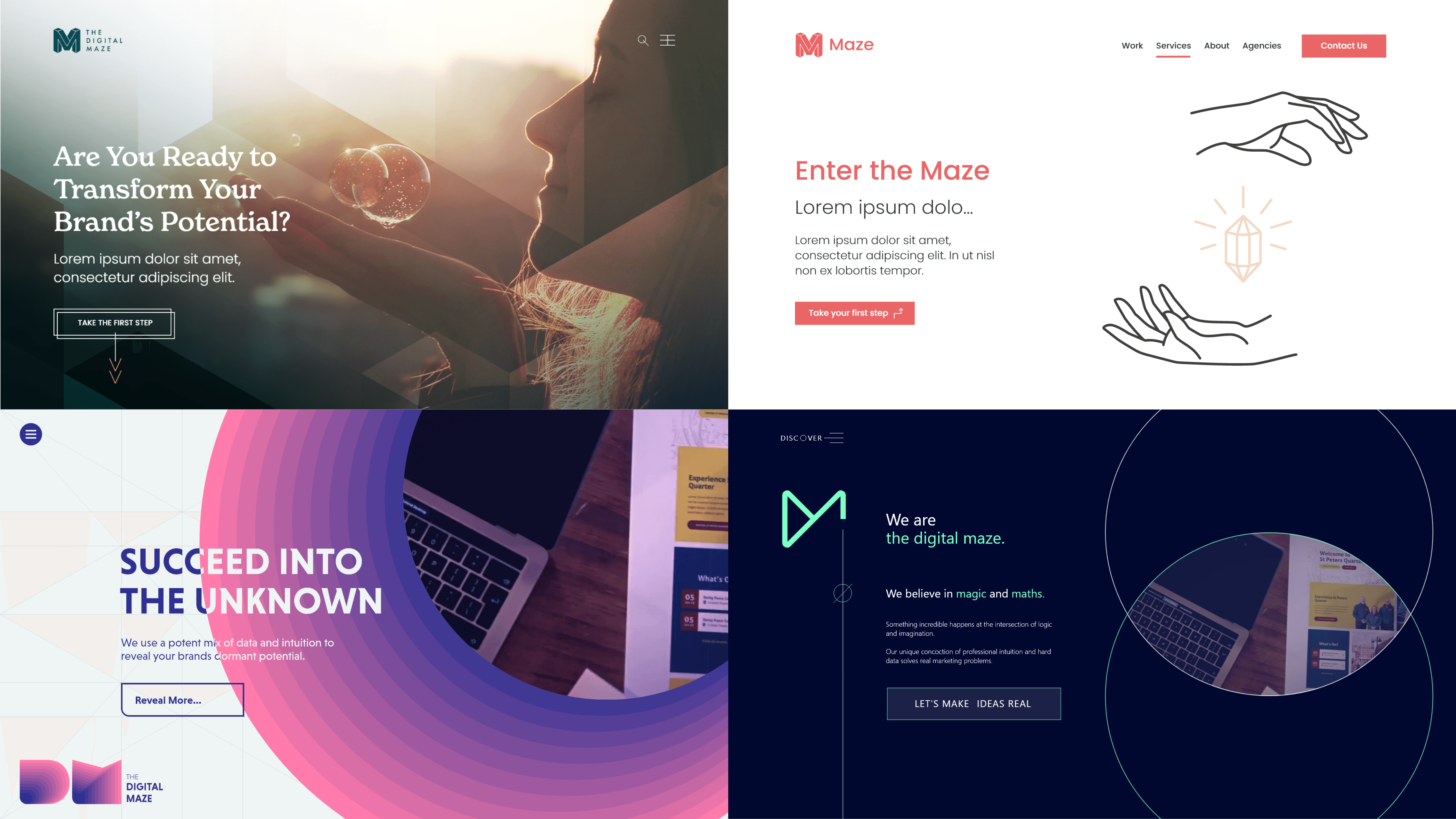
Like many rapidly growing organizations, our initial branding was born out of necessity rather than strategy—a quick solution to get us to market. This wasn't without merit, it got our foot in the door and thanks to a collaborative approach with all the designers from the merge - we did get a logomark out of it, that would actually survive into the next chapter.
As we expanded into new territories and faced new clients, it became clear that our brand needed to match the sophistication of our services, and with some placeholder branding doing the work, it bought us time to do it right.

Finding Our Archetype: The Engineer's Magic
Building stakeholder trust and discovering our true brand character
The journey to redefine our brand began with a crucial challenge: convincing our leadership that a thorough brand exploration was worth the investment of time and resources.
Working alongside Peter Bingham, we took our directors on a journey of discovery. Through carefully curated presentations, we explored competitor positioning and dove deep into various brand archetypes—from bold hero brands to rebellious challenger brands. Using extensive mood boarding and iterative discussions, we gradually built momentum for a bolder direction

Our methodical approach paid off. Through analysis and collaborative exploration, we discovered something fascinating: the "magician" archetype perfectly captured our ability to transform ideas into reality. Yet this wasn't the complete picture—our dedication to data-driven solutions and research-backed strategies suggested something more structured.
The breakthrough came when we discovered that within the Jungian system of archetypes, one of the magician's sub-archetypes was that of an engineer. This revelation perfectly encapsulated our dual nature: the structural thinking of an engineer combined with the transformative power of a magician. It wasn't just about creating magic—it was about engineering it with precision and purpose.
Visual Alchemy: Crafting the Portal
How we translated our identity into a distinctive visual language
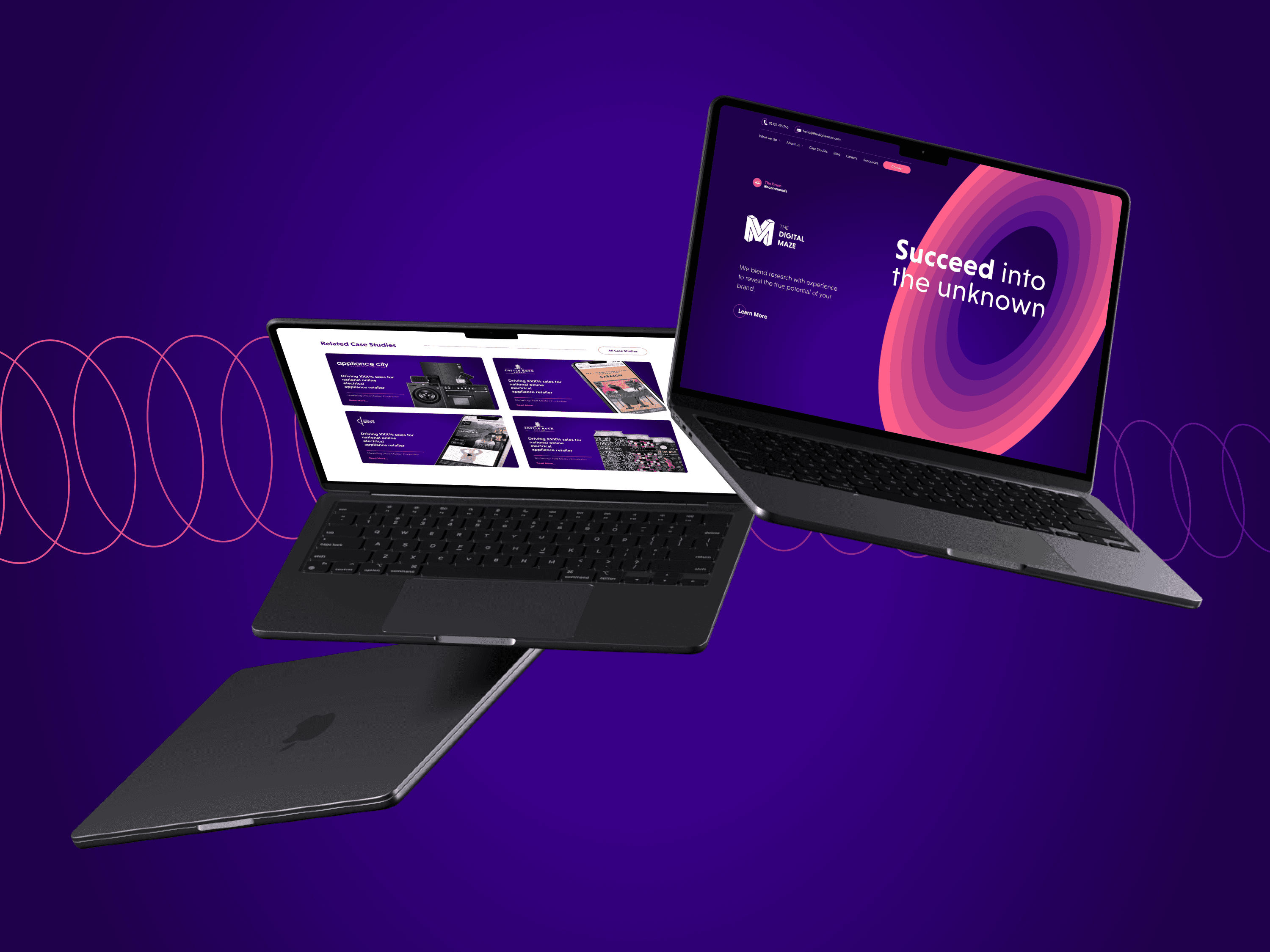
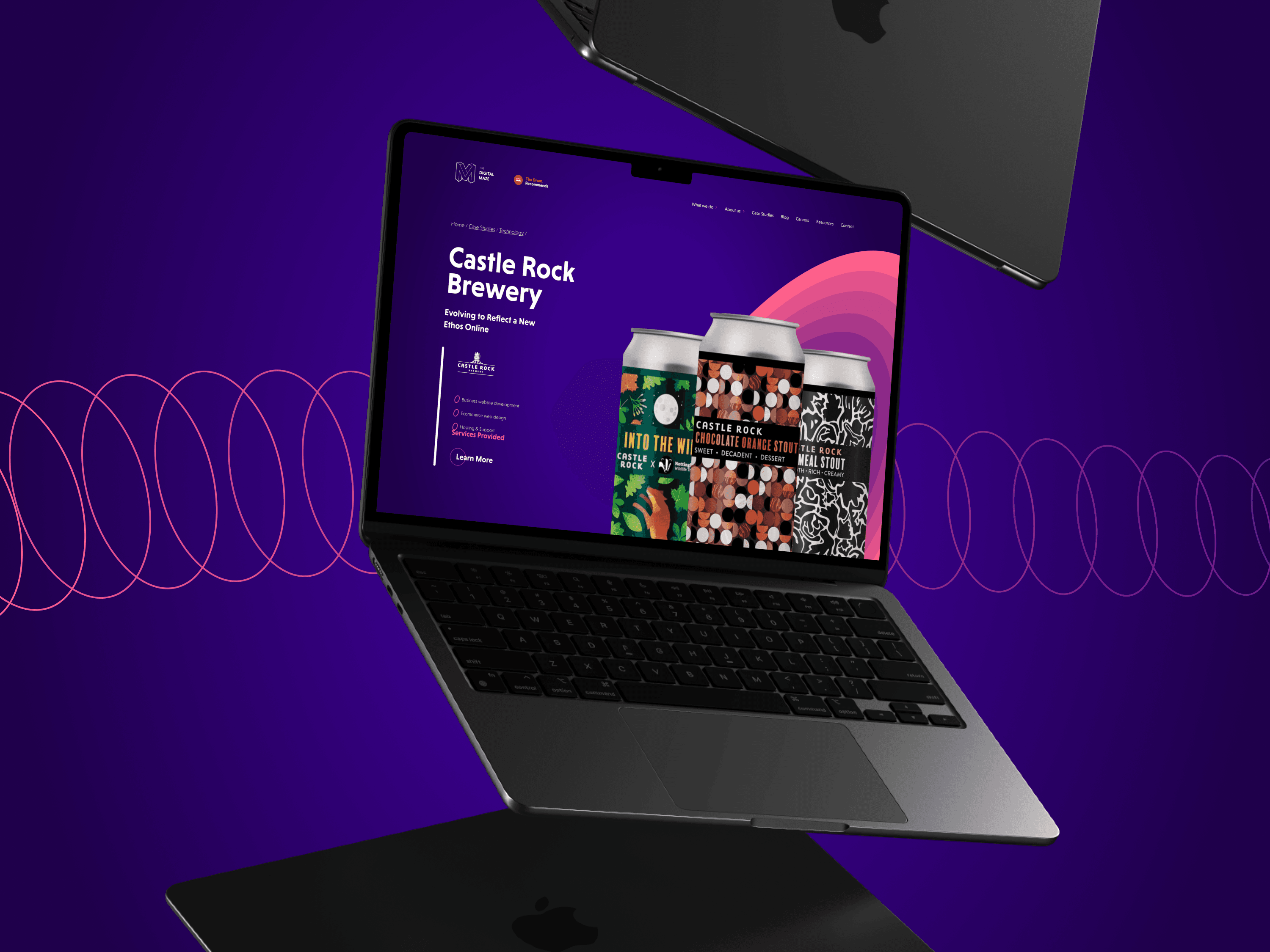
The visual journey to express this dual identity wasn't straightforward. Initial concepts exploring alchemical symbolism and artistry felt too literal. The breakthrough came when we returned to our core concept of transformation—specifically, the mysterious space where change happens.
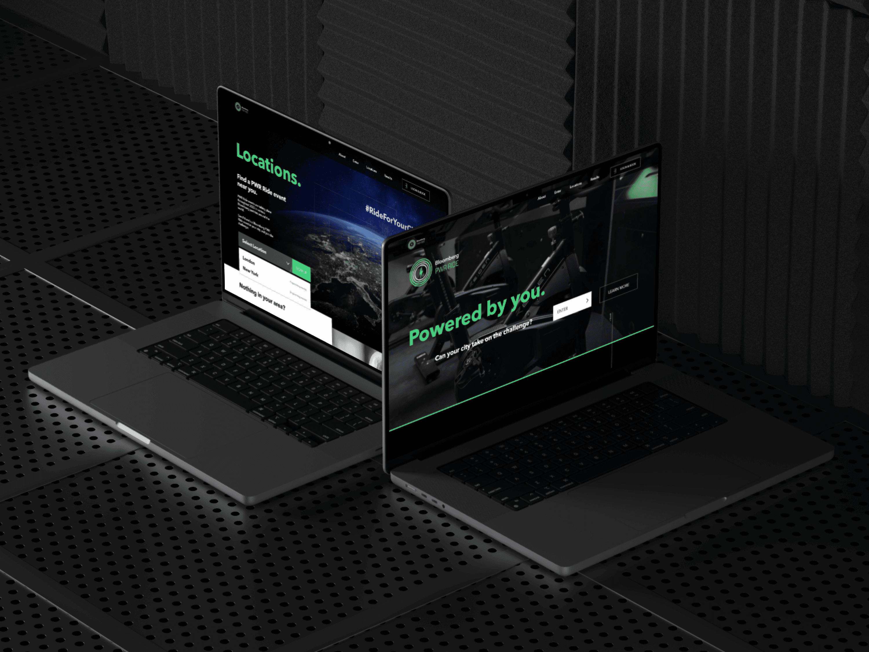
Inspired by Jodrell Bank's spectacular recent rebrand and the popular game "Portal," we developed a visual system centred around the that concept—gateways that represent the transformative journey from brief to reality. We chose an unexpected colour palette that pairs deep, mysterious purples with bright but soft pinks, creating a distinctive contrast that stands out in the agency landscape.
As I took off to build the web arm of the business, Peter would later take charge of the brand strategy going forward. Leveraging the brand we built, Peter and colleagues were able to take the brand from almost nothing to seeing impressions and clicks across all our platforms skyrocket in two years:
Impressions: +682%
Clicks: +463%
This visual system has become more than just a brand—it's a powerful tool that helps us stand out in a crowded market, particularly on platforms like LinkedIn and in pitch documents. Most importantly, it's given our content team a clear direction for tone of voice, always focusing on the intersection of creativity and data in driving transformations.

I’m thrilled with the look and feel of the rebrand, and it’s a testament to the creativity and perseverance of our whole branding team! From the developers, to the designers and copywriters it’s been a real team effort. We’re really excited to have a brand that better reflects who we are as a company, and also better matches our goals for the future.
Rob Twells, Director


This website was designed from scratch by hand in Figma, and brought to life in Framer (Not a template in sight).
(All works shown are copyright of either the employer or the client and are exhibited for informative purposes only)
Website design is copyright James Walsh © 2025