

Using brand archetypes to develop a caretaker brand for PHD Mail
Project Role:
Brand Designer, Researcher, Design Team Lead
Agency:
The Digital Maze
Client:
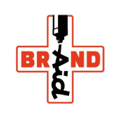
PHD Mail
Skills
Branding
Team Leadership
UX Research
Presentation
Client Workshops
Figma

PHD Mail approached us with a tired brand and no idea of direction.
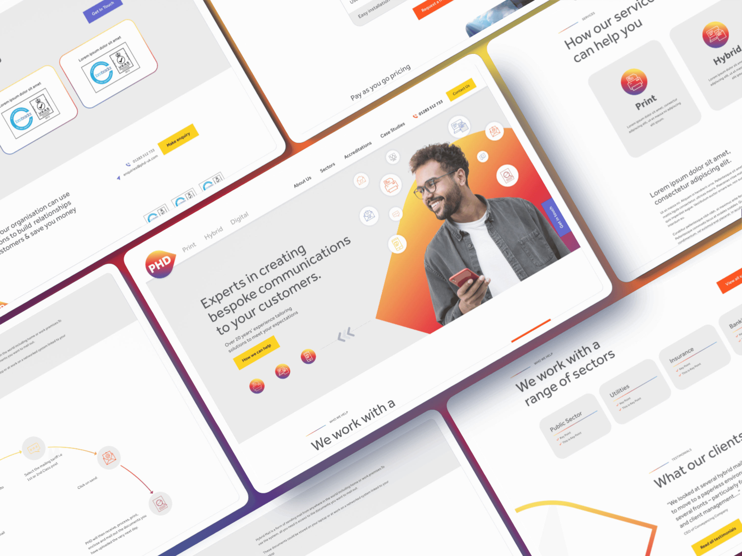
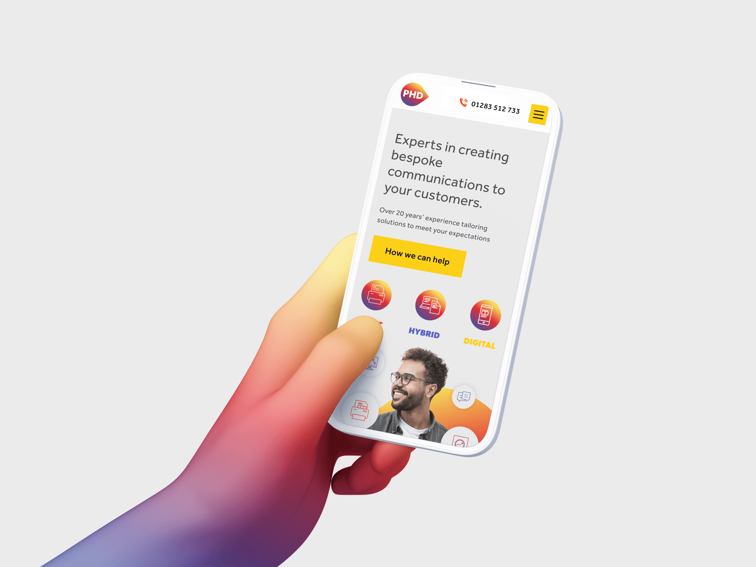
They needed to recapture what their service offers and promote that to customers new and old with a fresh new stance and modern website with a clean UI.
To get to the core of their business, we got together with core stakeholders and thrashed out what it is that they really do for their clients beyond just providing a service.

We decided to leverage the psychology of brand archetypes to give the client (and ourselves) a north star for the project. By identifying a personality that the brand encompassed, we always had a touch point for answering "what would this archetype do in this situation".
We also dove into options for structuring their brand architecture. PHD stands for Print, Hybrid, Digital - the three core pillars and sub-brands of their full service communications offering - so we wanted to look at which strategy better aligned with their future goals - monolithic, endorsed, or hybrid.

Taking care
Building a caretaker archetype brand.
The research including a quiz for the client to take that aligned their values with that of the twelve core Jungian archetypes, from the results it became apparent that they were a caregiver archetype.
With hindsight, this archetype made perfect sense to the core stakeholder group - PHD are often a port in a storm for their clients, calmly going the extra mile to meet tight deadlines, or suggesting simple tweaks that can save thousands on print run costs, PHD are the light at the end of the tunnel when you're in a tight spot and need to get those comms out yesterday.
With this established, I set out to construct three brand routes, each offering options for the three sub brands and the products branding beneath them.
I took the approach of wanting something solid and dependable, but resisting the temptation to lean into the cutsey that the caretaker archetype implies. The options spanned highcontrast colour blocks with solid black-weight sans-serifs (my personal favourite) and lighter options that offered a comfier choice.
We presented three routes:
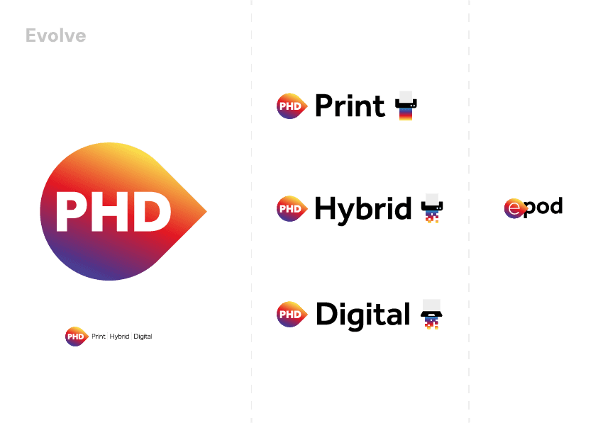


Ultimately, they chose the evolve option.
From there we refined the visuals and produced a simple set of guidelines that advised them on the usual options, but also gave them a steer on their brand voice to use in their onward content strategy.
Building out the concept.
Website routes

We took the client through some options for implementing this brand on the web - suggesting differing takes from members of the team, the option that went forward was from a senior designer on my team, Sarah Cleal. I worked with her to communicate the brand direction and she created an elegant UI structure that took their caretaker archetype to heart.


This website was designed from scratch by hand in Figma, and brought to life in Framer (Not a template in sight).
(All works shown are copyright of either the employer or the client and are exhibited for informative purposes only)
Website design is copyright James Walsh © 2025