

BuyerAlerts: a friendlier UI/UX for proptech
Project Role:
Lead Designer
Agency:
The Digital Maze
Client:
TwentyCI
Skills
Branding
UI Design
Client Communications
Figma
Prototyping
Web Design


TwentyCI are a company that handles large amounts of national property data. They have many property tech initiatives, that sell this data to the people you would expect; estate agents, solicitors and national telecoms companies like BT and Sky.
Traditionally this data is used for these people to send mail outs when they detect intent amongst buyers and sellers in the property market.
TwentyCI approached us to assist them with a new direction for a new product, They'd identified that this data could also be used by small businesses and individuals who need to sell their services to these sorts of customer - Think: electricians, carpenters, decorators, interior designers - the sorts of services that you might solicit after moving into a new property.
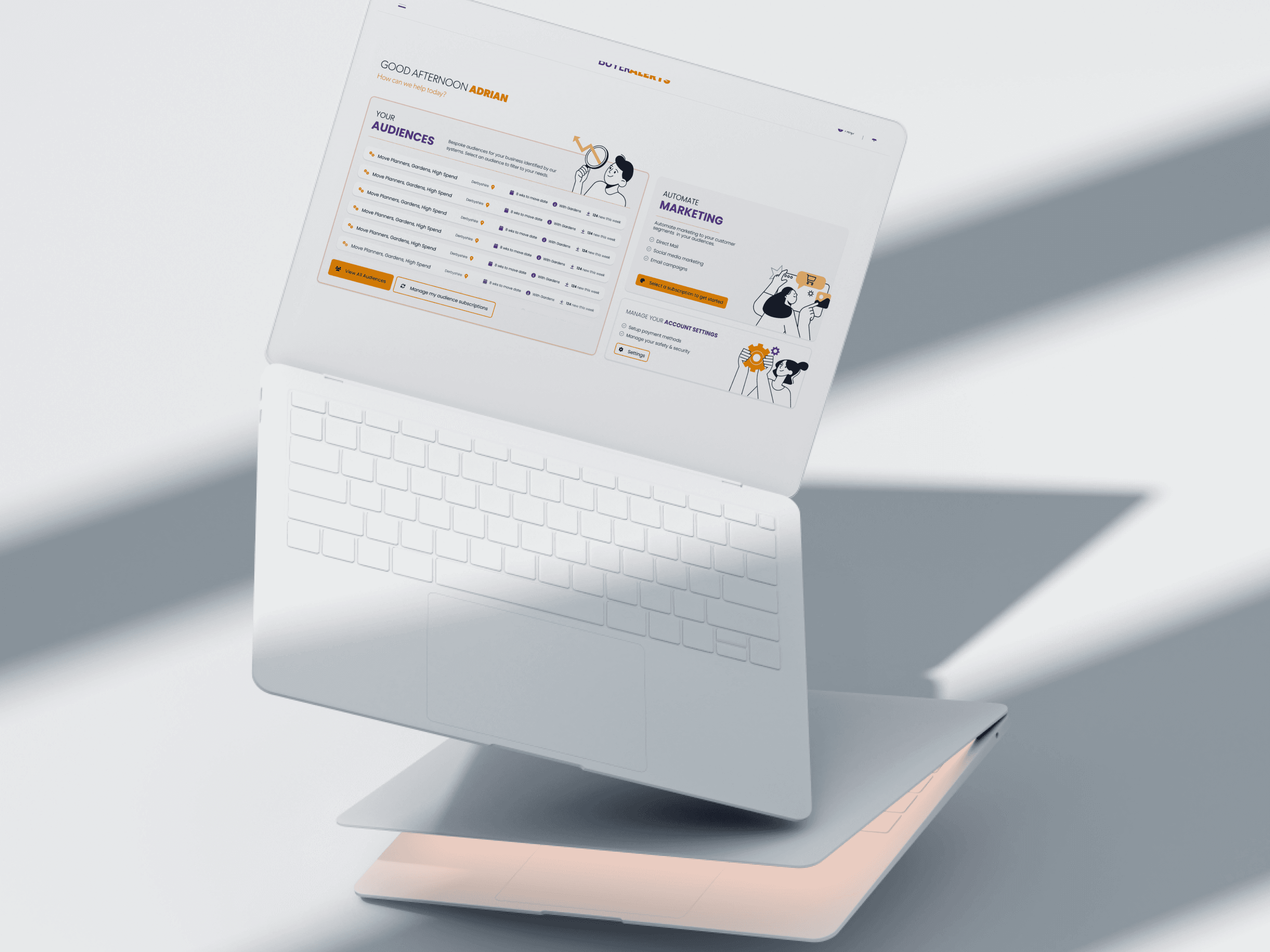
I worked with Ryan Shiels head of product at 20CI to develop a brand identity and design language that was radically different from the property tech systems they already had. They needed a design language that would soften the barrier to people who had never encountered this sort of data before but would also help communicate how useful it could be to them.
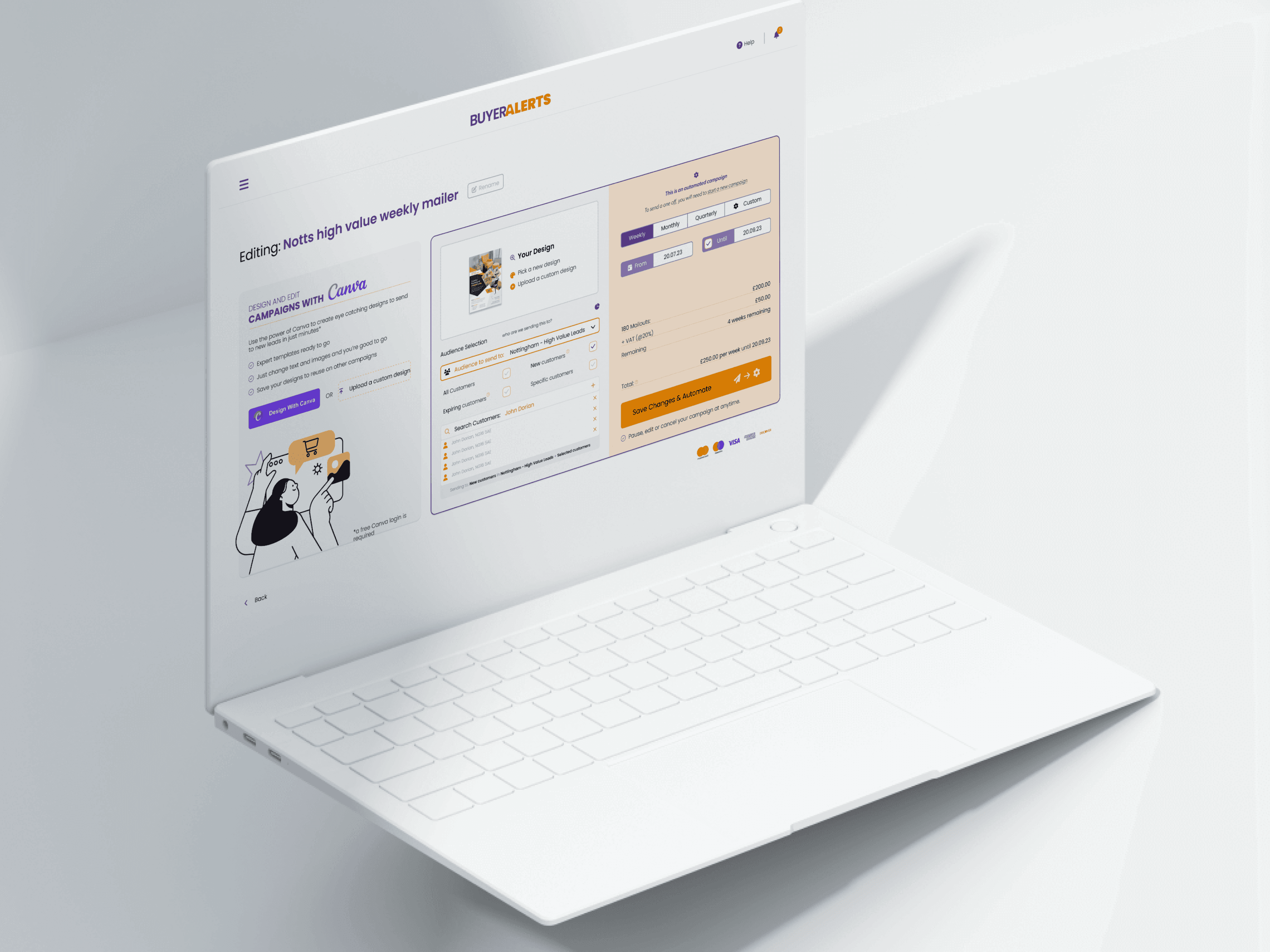
I continued to work with Ryan on a user interface and prototype in Figma that showed how customers would be on-boarded, how they could browse data to create custom subscriptions and how they could use the data to design campaigns (using Canva templates) and automate mailouts and billing.

Getting the customers through the door.
Opening the funnel with a landing page.
The project was capped off with a landing page designed to sell the product, we focused the copy and imagery on the idea of a hidden market of customers no one else was tapping into.
To help to remove some of the friction often associated with complex SaaS products, the design language was kept cohesive with the web app.

Billing and marketing strategy
The first one's free.
TwentyCI's usual customer base is locked in to the property data market and as such don't need or expect a leverage to get them to use their products. These customers are won as contracts through traditional pitching and sales methods.
With this being a totally new set of audiences who are not familiar with the data and what it can do for them. Whilst working on the UI design, I took the opportunity to discuss with Ryan to how they could get more customers through this new SaaS style funnel and encourage retention.
Approaches such as loyalty points and bespoke currencies were discussed - but ultimately we agreed that strategy that made the most sense was to give people a taste of the product for free. This was the most robust approach to showing people what this data could do for their business.


This website was designed from scratch by hand in Figma, and brought to life in Framer (Not a template in sight).
(All works shown are copyright of either the employer or the client and are exhibited for informative purposes only)
Website design is copyright James Walsh © 2025